Why clear ticket layout matters for your event entrance
The physical design of your ticket sets the tone for your entire entry process and directly affects how efficiently your team operates. If your staff have to search for the date, time, or entry gate on every ticket, those small delays quickly build up into long queues. A clear layout guides the eye naturally to the most important details, allowing door staff to check validity in a fraction of a second. By prioritising legibility and structure, you reduce the risk of arguments at the door and create a far more welcoming experience for your attendees.
Choosing which details to print on an event ticket
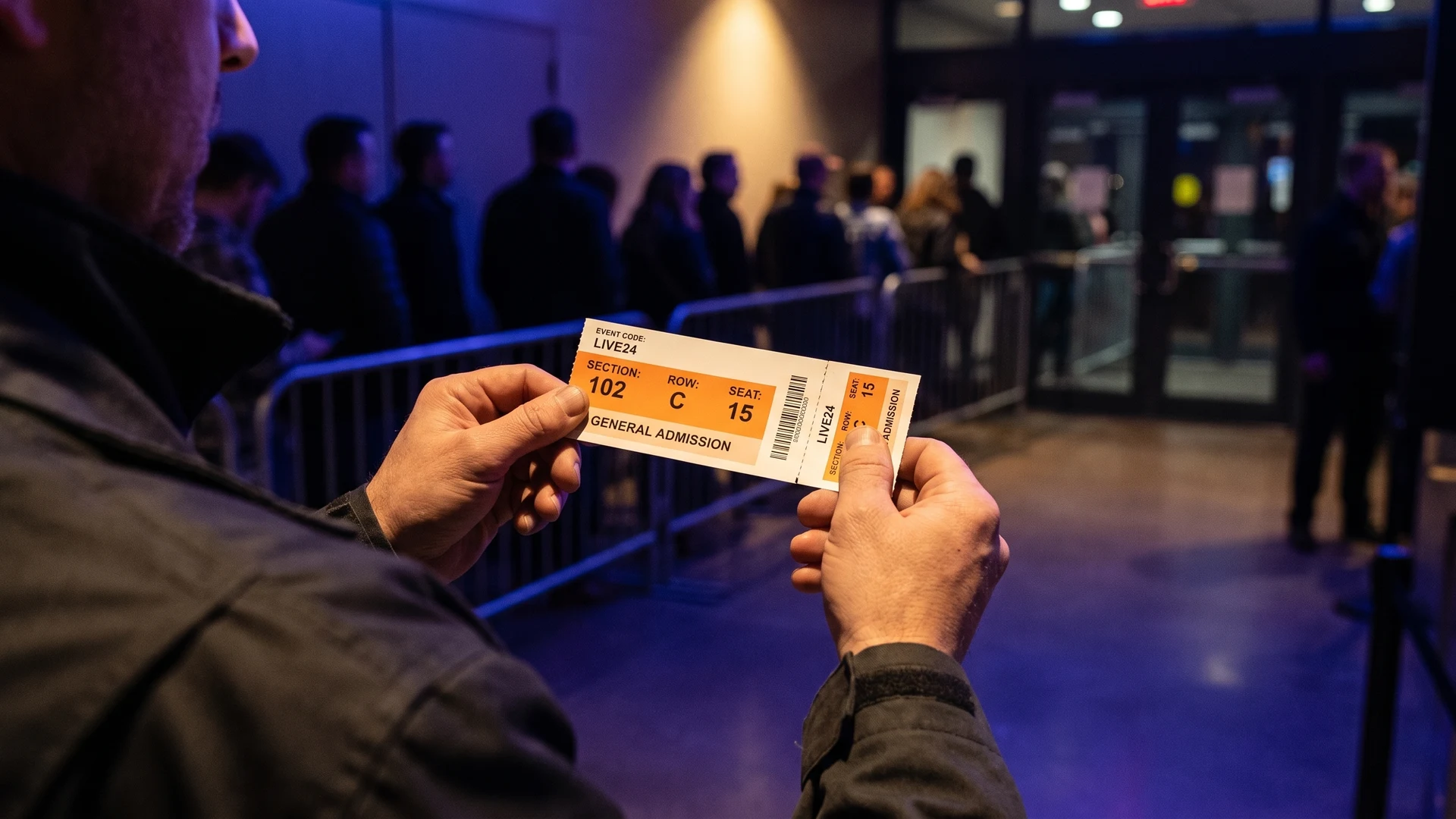
Keeping your printed ticket functional means deciding exactly which pieces of information your staff need to see at the entrance. The most essential details always include the event name, the specific date, the start time, and the relevant location or seat assignment. You should position these core elements prominently so they catch the eye immediately during a fast-paced admission period. Adding too much secondary text clutters the design and forces your team to actively read the ticket rather than simply scanning it visually.
Secondary information like detailed terms, sponsor logos, or venue rules should take a back seat to the primary admission details. You can place this less critical text on the back of the ticket or reduce it to a much smaller font size. This less-is-more approach ensures that the front of the pass remains a dedicated operational tool rather than a decorative flyer. When you remove unnecessary distractions, your team can process arriving guests with much greater confidence and speed.
Sizing and placing text for fast staff checks
Designing for fast staff checks requires a clear visual hierarchy that accounts for poor lighting and fast-moving crowds. You must structure the typography and contrast so that your team can identify valid entry credentials in a split second. Focusing on text size, colour differences, and safe placement ensures the physical pass functions perfectly during the busiest moments of your event.
Increasing text size for dates and times
Printed admission tickets require specific font sizes to remain legible when staff check them quickly. You should use a bold font between 12 point and 14 point for the main event title or heading to grab attention immediately. For the absolute most crucial scanning details like dates, times, and seating assignments, choose a clear size between 10 point and 12 point. Using a clean sans-serif font like Arial or Verdana helps these letters stay sharp and readable at smaller sizes.
You must avoid shrinking your text just to fit more words onto the layout. Fine print should never drop below 7 point or 8 point, and you should reserve this tiny text purely for legal disclaimers or tracking numbers. Because screens often make tiny text appear larger than it is, you should always print a physical proof at full scale. This physical test ensures your team will actually be able to read the dates and times under realistic event conditions.
Using contrasting colors for different ticket categories
Colour contrast dramatically dictates how quickly and accurately your staff can verify different ticket types in a fast-paced environment. High luminance contrast, which is the light and dark difference between text and background, triggers a subconscious recognition process for your team. When you pair bright text with a dark background, a ticket checker can verify the zone clearance in under a second without pausing the line. This immediate recognition prevents the cognitive fatigue that staff experience when trying to read low contrast designs over an eight-hour shift.
Relying strictly on hue without luminance contrast creates major verification delays, especially for staff with colour blindness. If you only use a green dot for general admission and a red dot for a Very Important Person (VIP) section, poor lighting will make them indistinguishable. Instead, you should always pair high contrast colours with distinct geometric shapes and clear text labels to standardise verification speeds. This combination ensures every member of your workforce can confidently identify the correct ticket category regardless of the lighting conditions.
Placing key details away from the tear-off stub
A tear-off stub is the detachable section of a physical ticket that staff collect or remove upon entry. You must place key event details safely away from these perforation lines to prevent critical text from becoming mangled during the tear. Tearing along a perforation often leaves rough or jagged edges that can easily obscure the date, time, or venue name if they sit too close to the line. Keeping this primary information central ensures it remains fully readable even if the tear is not perfectly clean.
When your door staff collect the stub, the main body of the ticket stays with the attendee. You must ensure that any essential information the guest needs to keep remains securely printed on that main body section. If you position seat numbers or venue rules on the stub, the visitor will lose that information as soon as they walk through the door. Organising your layout with clear margins around the perforation protects both the staff validation process and the guest experience.
Layout choices for one day events
For a standard one-day event, you should strip back any unnecessary complexity to make the admission process as straightforward as possible. Your layout needs to focus purely on the specific date, the venue name, and the basic access level granted to the holder. Because the ticket is only valid for a single entry, you do not need multiple tear-off sections or complex day-by-day colour coding. A clean central design with a single stub provides all the structure your staff require to process guests efficiently.
You can improve the flow of a single-day event by using a bold, singular background colour that represents the specific date. This allows your team to spot tickets from previous events or counterfeit attempts before the guest even reaches the front of the queue. Keep the text layout highly symmetrical so that the eye naturally falls to the centre of the card during verification. This simple, reliable approach gives facility managers exactly what they need to keep the entry lines moving without confusion.
Adapting your layout for multi day passes
A multi-day event requires a more structural approach to ticket layout to ensure guests use the correct pass on the correct day. When a single physical document covers separate entry times, your design must clearly separate the different access periods. Planning your colours, perforations, and validity indicators carefully helps reduce entrance disputes and keeps the operation running smoothly.
Assigning a distinct color block to each day
To help security staff instantly verify valid entry dates from a distance, you should assign a completely unique, high-contrast colour block to each specific day. For example, you might choose bright blue for Friday, neon green for Saturday, and solid orange for Sunday. Using sharply contrasting colours for consecutive days prevents gate staff from confusing similar shades like teal and navy under shifting outdoor lighting. This distinct colour coding rotation strategy stops expired credentials from slipping through the gates.
When you issue full-weekend passes that grant access to all days, you must give them a completely separate visual identity. You can use a distinct pattern, a multi-coloured layout, or a bold full-weekend label so these guests are never mistakenly pulled aside by security. You should separate different access levels, such as staff or media, using bold text labels and distinct shapes rather than relying on lighter shades of your daily colours. This approach guarantees that colour always communicates the day of entry rather than confusing the guest’s role.
Positioning multiple perforations correctly
Physical multi-stub tickets use multiple perforations, which are lines of tiny slits and uncut paper ties that allow clean tearing. You can position these perforations parallel to each other to create a sequential series of tear-off sheets for consecutive days. Alternatively, you can use perpendicular perforations that create a grid, which splits a single stub section into smaller individual vouchers for food or drinks. These structural choices allow you to manage multi-day entry while letting the customer keep their main ticket body intact.
To ensure the ticket functions properly without falling apart prematurely, you must follow strict spacing guidelines during the design phase. Perforation lines typically need to be spaced at least a quarter of an inch apart to maintain the structural integrity of the paper. If you place the lines too close together, the paper will shred or tear accidentally during handling. You must also leave sufficient margin clearance around the perforations so that tearing the stub does not destroy vital validation data on the main pass.
Making the pass validity obvious at a glance
For multi-day events, your staff cannot afford to spend time closely reading the fine print to determine if a pass is valid. You must make the validity obvious at a glance by combining large date text with immediate visual indicators like prominent day-of-the-week labels. Positioning this information at the very top of the ticket or along the most visible edge ensures it is never hidden by the user’s thumb during handovers. This immediate clarity empowers your staff to make fast, accurate access decisions.
If a pass includes separate stubs for different days, clearly number and label each section in bold typography. You should design the ticket so that the current day’s stub is always the most accessible one to tear off. When validity is instantly clear, you eliminate the friction of staff accidentally taking the wrong stub and causing problems for the guest the following day. This careful layout protects the operational flow and reduces stressful confrontations at the facility entrance.
Planning layouts for timed entry tickets
Events that rely on strict entry windows require a ticket layout that highlights specific time slots above all other information. You should place the exact entry time in the centre of the pass using the largest font size available on the layout. Highlighting the time slot with a bold bounding box or a contrasting background colour draws the checker’s eye immediately to the most critical restriction. This prominent placement helps staff instantly spot attendees who arrive too early or too late for their scheduled window.
Clearly visible time slots help reduce friction and confrontation at the door, which is a major pain point for facility managers. When the entry window is undeniably clear on the ticket, guests are far less likely to argue about their assigned arrival time. You can further support your staff by including a brief line of text explaining the grace period directly beneath the main time. Providing this clear, accessible information keeps time-sensitive events on schedule and prevents bottlenecks from forming outside the venue.
Structuring sequential numbering on the ticket
Sequential numbering gives every ticket a unique number within a defined series, which is essential for tracking and post-event reconciliation. You must position these numbers symmetrically on both the main body of the ticket and the detachable stub. Placing the numbers at opposite ends of the ticket ensures that both pieces retain their tracking identity after the staff member tears them apart. This matched numbering system allows your team to accurately compare collected stubs against the remaining ticket stock once the doors close.
You should print the sequential numbers in a clear, highly legible font that contrasts strongly with the background paper. Avoid placing the digits too close to the perforation line, as a messy tear could easily remove the final digit and ruin your audit trail. Keeping the numbers isolated in a dedicated white space box makes them easy to read in low light and prevents them from blending into decorative graphics. This simple structural choice reinforces your ability to track attendance and investigate discrepancies properly.
Steps for processing event tickets at the entrance
A well-designed physical ticket only improves queue times if your team follows a clear and consistent operational workflow. Establishing a reliable procedure ensures that every staff member processes the layout exactly as intended. Training your team on these specific actions builds their confidence and keeps the entrance moving at a steady pace. You can use the following sequence to guide your staff through the validation process.
- Greet and verify: The staff member welcomes the guest and checks the prominent date and time printed on the front of the pass. This immediate visual check ensures the visitor has arrived for the correct session before any tearing occurs. Addressing the guest politely also sets a positive tone for the entire event experience.
- Check the category: The team member looks at the background colour and large text labels to confirm the specific access level. This step instantly identifies whether the guest requires general admission or a VIP wristband. Staff can quickly direct attendees to the correct zone based on this clear visual information.
- Separate the stub: The staff member firmly holds the main body of the ticket and tears cleanly along the perforation line. They must perform this physical action carefully to ensure both the main ticket and the stub retain their printed information. Keeping the stub intact guarantees that the sequential numbers remain readable for later checks.
- Return and retain: The door worker hands the main body of the ticket back to the attendee for their personal reference. They then drop the separated stub into a secure collection box located next to the entrance point. This final step completes the entry process and provides the necessary physical record for post-event reconciliation.
Reviewing your ticket design before printing
Conducting a thorough review of your layout before committing to a physical print run prevents costly mistakes and operational headaches. You should print a full-scale test copy to verify that all text sizes remain legible and that colours contrast correctly in dim lighting. Check that your critical details and sequential numbers sit safely away from the perforation lines to avoid accidental tearing. Completing these simple final checks leaves you feeling fully prepared and in complete control of your physical ticketing procurement.
What font sizes work best on a printed event ticket?
Set the event title at 12 to 14 point in bold. Put date, time, and seat at 10 to 12 point. Use 9 to 10 point for secondary text, and 7 to 8 point for fine print. Pick a sans serif font, good contrast, and test print at full size.
How should I use color contrast so staff can verify tickets at a glance?
Use strong light and dark contrast so staff can verify faster. Aim for about 4.5 to 1 contrast for standard text and 3 to 1 for large symbols. Do not rely on color hue alone. Pair color with clear labels or shapes, and proof under bright sun and low light.
Where should I place barcodes or Quick Response codes and other key details around perforations?
Place barcodes and Quick Response codes well away from perforations. Keep essential details on the main ticket body, not on the tear-off stub. Leave at least 0.125 inches of clearance around perforations to protect readability and scans. Avoid placing critical text or codes on the tearing edge.
How do I design multi-day passes so the right day is obvious?
Use one distinct, high contrast color per day so the valid date is obvious. Give full weekend passes a clearly different color or pattern to avoid confusion. Print the day in bold text, and add shapes or labels so color blind staff can confirm quickly in varied lighting.
What should I highlight on a timed entry ticket to keep queues moving?
Put the entry window near the top in larger, bold type with the date beside it. Keep it at 10 to 12 point or larger, with good contrast. Remove clutter around it so staff can find it quickly. If you collect a stub, repeat the time on both sections.